
SOFAROOMS / EXETER / WEBSITE REDESIGN
Sofarooms
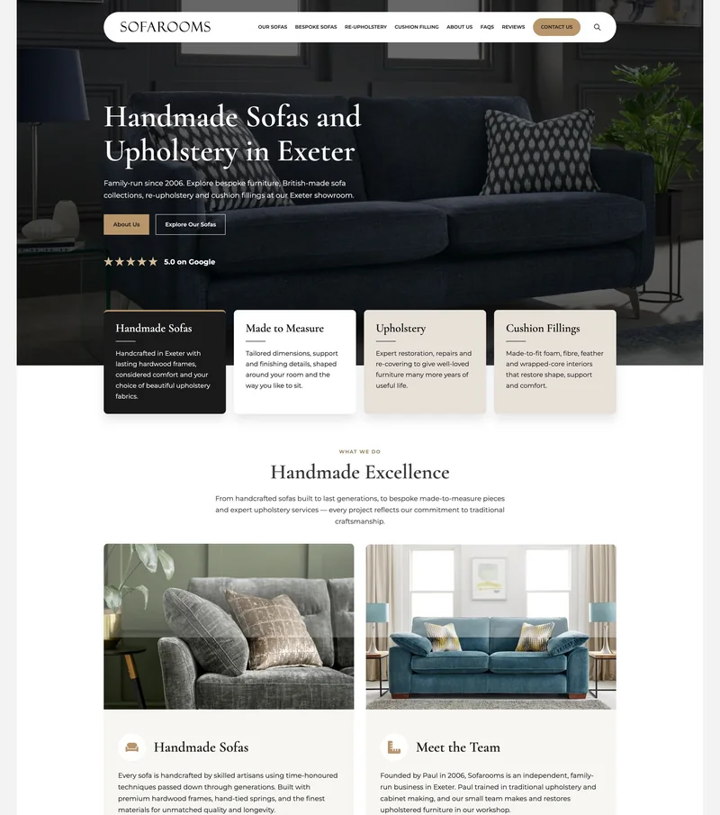
Handmade furniture deserves a website with the same care and attention. A complete redesign for Sofarooms in Exeter, replacing a cluttered Wix website with a clearer, more confident showcase for its sofas and upholstery services.
THE BRIEF
Bringing the showroom experience online.
Sofarooms is a family-run furniture business in Exeter, established in 2006. Its offer brings together British-made sofas, made-to-measure designs, re-upholstery and cushion fillings. The website needed to communicate that breadth without overwhelming visitors, while giving the quality of the furniture room to speak for itself. My aim was to create an online introduction that felt as considered as the products: welcoming, easy to explore and clear about the next step.
BEFORE / THE WIX WEBSITE
Good craftsmanship. A muddled first impression.
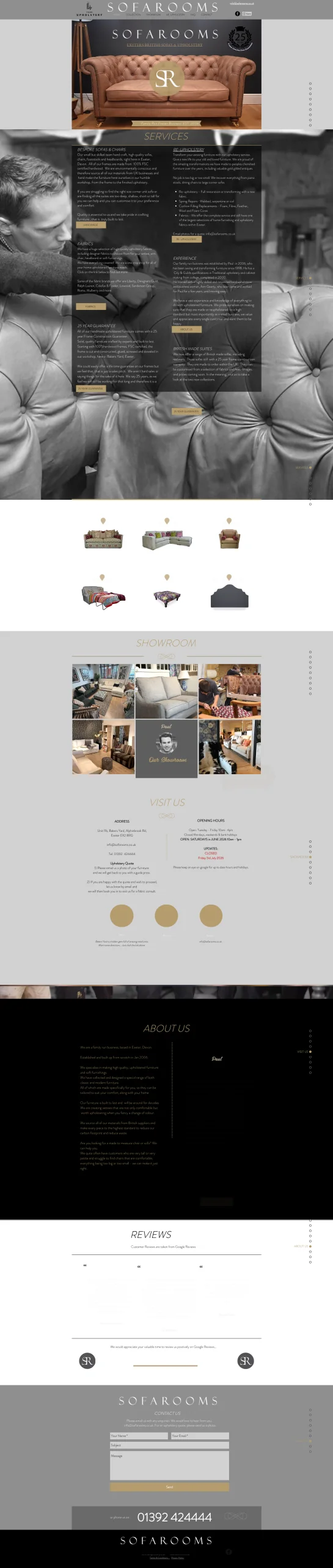
The previous website contained plenty of useful information, but the presentation made visitors work to find it. The supplied desktop screenshot shows a narrow content area, dense columns of copy and large background photographs competing with the words. The story of the business was there; it needed a clearer order and a more readable design.
01 / THE OLD DESIGN
Text competing with photography
Service descriptions sat over a detailed upholstery photograph. Even with dark panels behind the copy, the background added visual noise. Small text and muted colours also made parts of the About and Reviews sections difficult to pick out in the supplied screenshot.
02 / THE OLD DESIGN
Too much information at the same level
Services, fabrics, experience and guarantees were grouped into closely packed columns, with similar-looking headings and buttons. There was little distinction between the main services and supporting detail, making the page harder to scan.
03 / THE OLD DESIGN
A long route to the next step
Showroom details, opening hours and the main contact form appeared further down a long page. Small calls to action and repeated dot navigation offered less guidance than clearly named service links and a prominent contact button.
THE TRANSFORMATION
Before & after
From a busy Wix website to a clearer, more considered showcase. Compare the opening sections below, or select either preview to explore the full homepage.
Before
The original Wix website
Select image to enlarge
After
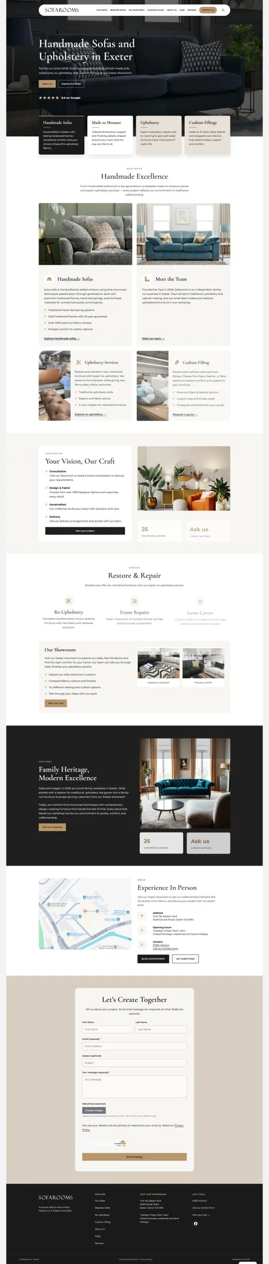
The redesigned Sofarooms website
Select image to enlarge
THE APPROACH
Let the furniture lead. Make the journey clear.
I brought the focus back to the furniture and the people behind it. A generous hero image establishes the character of the brand, while the headline immediately explains what Sofarooms offers and where it is based. The supporting copy introduces its family-run background and core services in a few readable lines. Visitors can understand the business before they start scrolling.
01 / DESIGN
A more considered first impression.
Large product photography, expressive serif headings and warm gold accents give the new website a sense of quality and comfort. Clearer spacing and quieter backgrounds separate the content from the imagery, so visitors can appreciate both. The design gives the furniture the prominence it deserves.
02 / STRUCTURE
Four services. Clear ways in.
Handmade sofas, made-to-measure furniture, upholstery and cushion fillings each have a distinct introduction. Named links in the main navigation help people go straight to the service they need, while the homepage offers a simple overview for those still exploring. A prominent contact button keeps an enquiry within easy reach.
03 / CONFIDENCE
The right details, earlier.
The new opening section brings together the Exeter location, the family-run story and the Google review rating shown in the supplied design. Those details help introduce the business alongside the products, rather than leaving visitors to discover its background much further down the page.
THE RESULT
A better showcase. With performance to match.
Sofarooms now has a website that presents its furniture and services with clarity and confidence. The transformation is visible in the first screen: a stronger introduction, a more legible layout and obvious routes to explore or enquire. It gives an established local business an online presence that better reflects the care behind its work.
GOOGLE LIGHTHOUSE
100 across all four categories.
The completed website achieved scores of 100 for Performance, Accessibility, Best Practices and SEO in the project’s reported Google Lighthouse assessment.
100
Performance
100
Accessibility
100
Best Practices
100
SEO
Results supplied for this project. Lighthouse scores reflect the pages and test conditions assessed; they are not a guarantee of search rankings.
GOOD THINGS START WITH A CONVERSATION
Have something similar in mind?
A new business, a fresh start, or a website that’s ready for more. I’d love to hear what you’re thinking.